

Tip #2 – COMPLEMENTARY COLORS
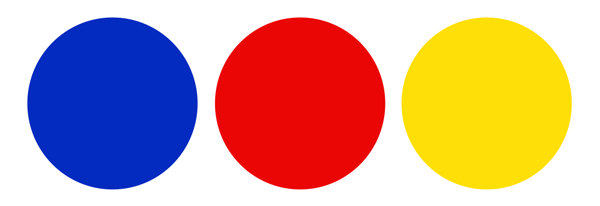
Last week our art tip was on value. This week we’re going to talk about using color theory and complementary colors. In this image (below) you should see three colors. Blue, red and yellow. These are called primary colors. And are really the base of all other colors including white.
Next, come the secondary colors. These are colors that are made by mixing the primary colors together.
After this comes the tertiary colors. Tertiary colors are made by mixing the secondary colors and the primary colors together.

So, if you combine all these together, you’ll get a wheel that looks like this. In other words, the color wheel.

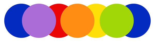
Complementary colors are across from each other on the color wheel. For example, blue is across from orange, so orange and blue are complementary colors. In this next image, it shows three complementary color sets that I pulled out from the color wheel.

Colors can be really flexible, so once you have your base, for example, blue and orange–you can really begin to play! There’s a large variety of blues and a large variety of oranges so the intensity and value of the blues and oranges can change with your preference. There is so much you can do with basic color theory that it can get really exciting.
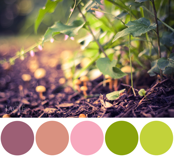
One thing I find interesting, is that when a picture or drawing seems to come together well, it could be that complementary color scheming is making the difference. Take the examples below. Do you see the green/red complementary color scheme? I can’t say its necessarily the dominant scheme, but it is in there. And notice, too, that the “reds” are not really bright red. They are more like colors close to red or derived from red, which is a definite key in playing with color. In other words, a reddish-orange could complement your aqua-blue, or a brownish-orange could complement your purple-blue.
Note: I do want to mention that this is just one way you can bring your colors together well (complementary color scheming). There are other ways to use color theory/harmony and I hope to address those in a later post(s)!
So how can this tip of the day be applied to coloring paper doll dresses?