
Tip #1 – VALUE
Study the image (below) carefully. The first row of dots at the top are line of blacks/grays that range from very dark to very light. These are each called different values. One is lighter than the other. One is darker then the other. Next, you’ll see a row of red dots. These are different values of the color red. Some are lighter reds, others are darker reds. After this, you’ll see a row of different colored dots.
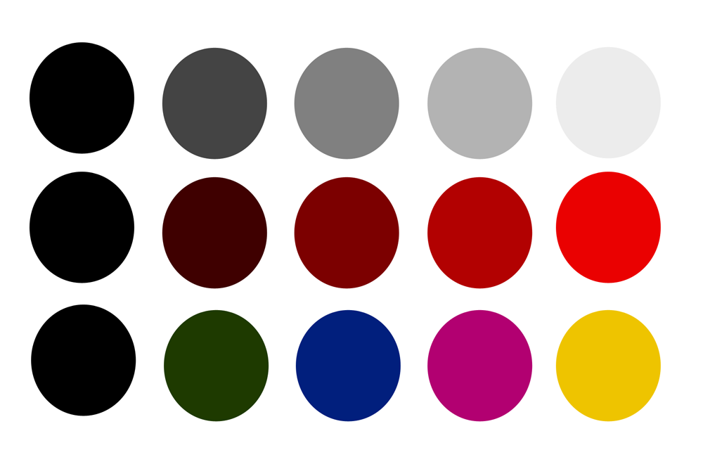
Guess what … the last row of dots are almost the exact same in value as the dots above them. The dot on the far right is almost the exact same value as the far right dots above it. This is where color values can get a little tricky. What one can think is a certain value may not actually be that value. Just like this image (below) the lightest gray dot is actually almost the exact same value as the yellow dot. It doesn’t quite look like it, does it?
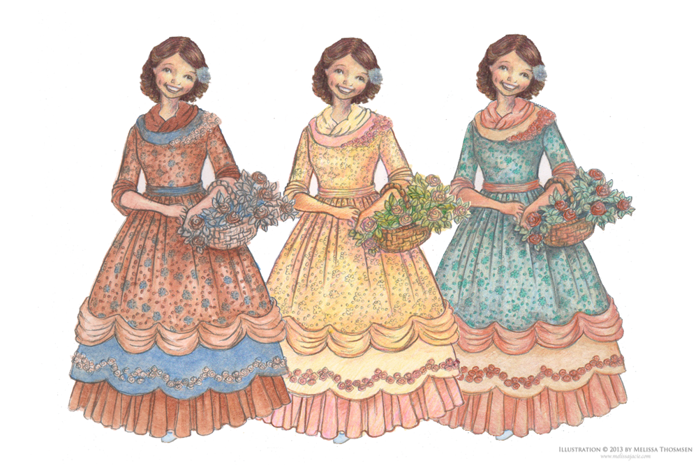
So, how does this apply to coloring a paper doll? Well, when coloring try to make sure that you keep a good range of values in your colors. Here’s an example:
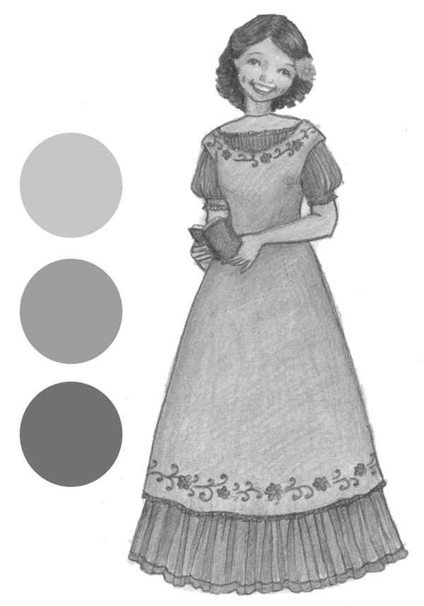
Here it shows three sample values from the picture. One way to make your coloring come together well is to vary your values–making sure that there are dark values and light values.
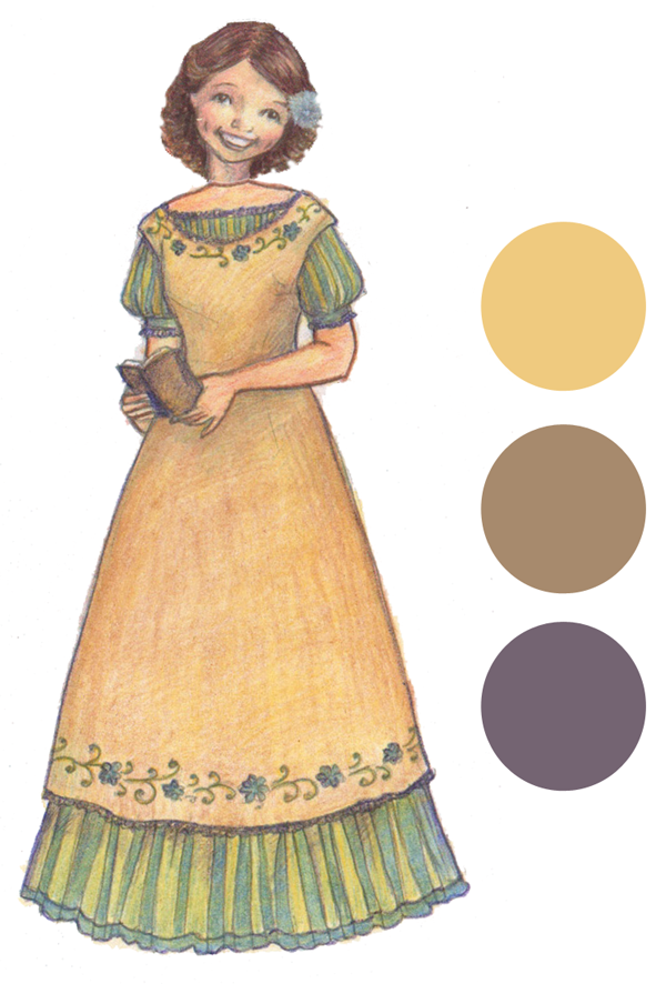
So what how can this tip be used in coloring paper doll dresses?