
Tip #3 – Observation
The past two tips have been on value and complementary colors. This week we’re going to talk about observation. In other words, observing the colors around us and using what we learn, in our art.
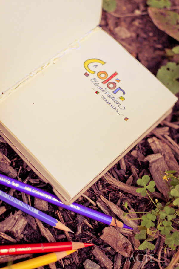
1. To start, find a sketchbook, or small notebook that you can carry around with you easily. Along with it, add a yellow, blue and red colored pencil. These will be your observation tools. Make sure that they are small enough to fit into your purse or pocket. (You can also re-use a sketchbook, like I did. I took this black sketchbook and tore out the front pages which held a random assortment of things, and changed it into a color observation book.)
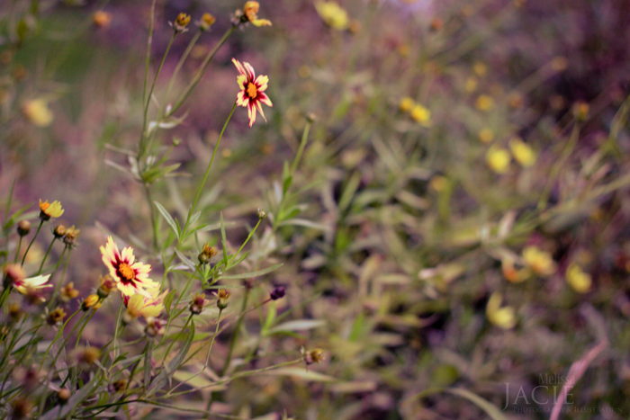
2. Look around you. Find something to observe. It could be a basket of fruit, a book, a picture, a cushion, a plant, or something else. (Make sure that the object has colors on it that seem to come together well.)
3. Take out your pencils and notebook and create three circles.
4. Create three of the colors on the object before you.
5. Make note of where your observation is from and date it.
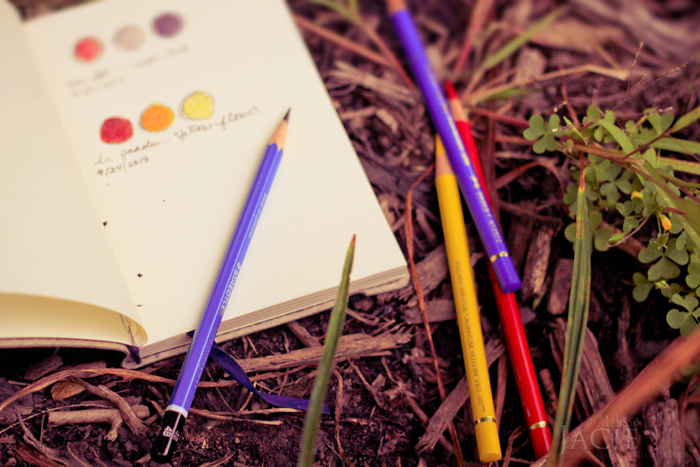
The three lower circles in this picture are three sample colors from flowers represented in the picture above.
This is just a start. Eventually, you’ll probably want to expand your number of circles and sometimes you may want to use more than just layering with the yellow, red and blue.
Here are some tips for growing in observation.
– Look at things that have already been created–a book, a patterned piece of fabric, a store logo, a piece of artwork, etc. By learning and gleaning from what other artist’s have done we can expand our ideas for designing with color, which will help us to keep from getting in a rut and expand our minds.
– Look at nature. When on a hike or out playing in the snow, keep an eye out for beautiful color combinations.
– Ask yourself questions when observing. Why do those colors seem to look good together? Are they complementary colors? Does this pattern seem to really blend together well, or does it stand out? Why did this picture/scene/pattern catch my attention?
Once you have this store of ideas for good color combinations, you can use them in your artwork.
So how can this tip of the day be applied to coloring paper doll dresses?

{I’m finally getting around to some back-logged posts in my feed-reader…}
Wonderful idea, Melissa! I love using journals and notebooks to keep up with observations, ideas, and snippets of the beauty and life around me! Even if you don’t refer back to it, you had to stop and take the time to actually see something.
Aw, thanks Michelle! :-) Journals are fun, aren’t they? Have you ever experimented with taking a blank journal, using scrapbook paper and decorating the front with the paper? It’s really fun. Earlier this year I made two patchwork-looking journals and I really like how they turned out!